


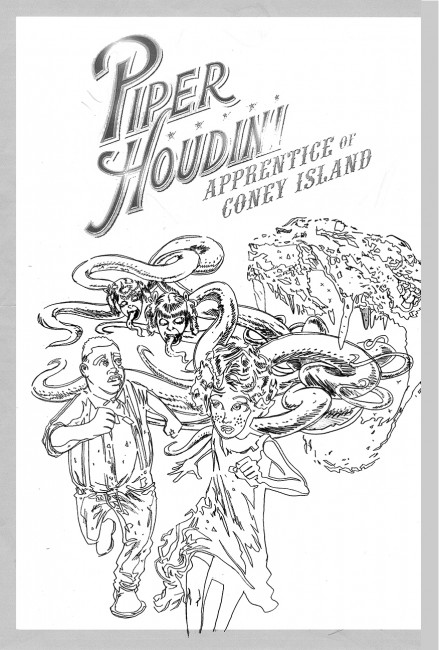
When I asked John Kissee to create the cover for the second Piper Houdini novel, Nightmare on Esopus Island, we started with a simple premise: make it look like a cover from a 1920s pulp fiction magazine. Here was his initial sketch…
Nice job, John! Only Piper looks a bit anorexic,
and tentacle-twins are too close together…
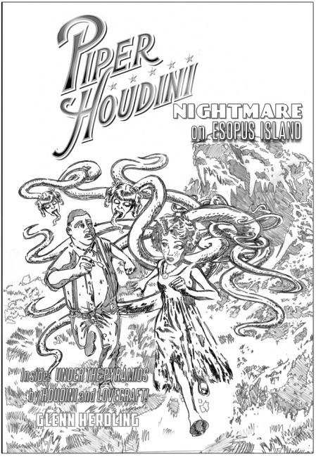
Okay, that’s better! Let’s see it fleshed out as line art…
Looking real good! Now let’s see how it looks in color!
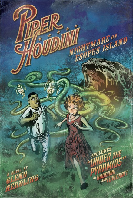
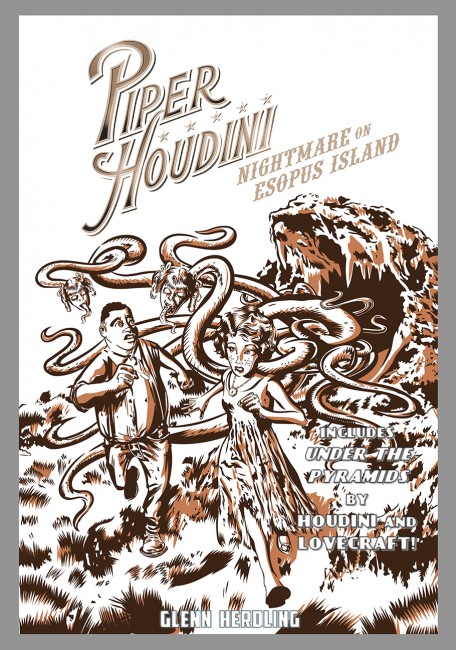
Wow! That’s amazing! It really captures that classic pulp feel.
I just want you to tweak a couple of things…

Perfect!
